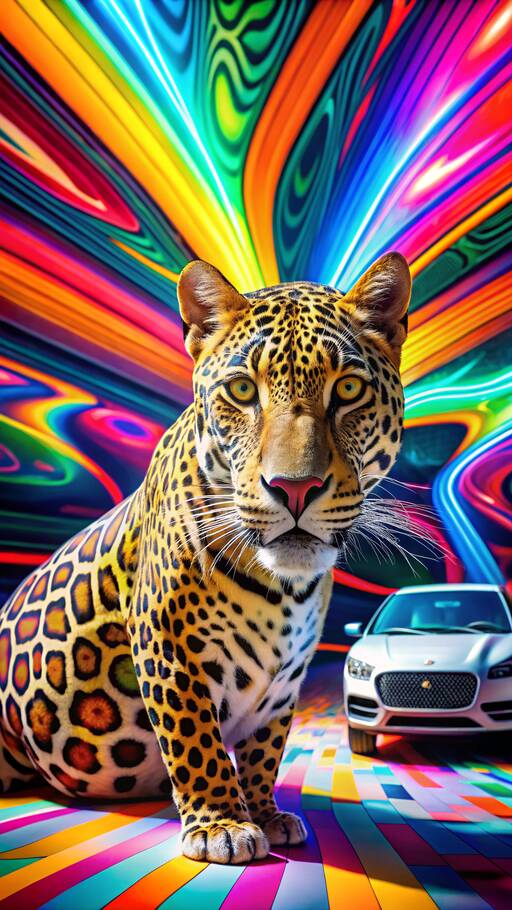
Jaguar introduces 'Copy Nothing' as its guiding principle, harking back to founder Sir William Lyons. The transformation is centered on ‘Exuberant Modernism,’ which Jaguar describes as embodying bold designs, innovative ideas, and fearless creativity.
In an interesting twist, a new typeface featuring a capitalized 'G' and a revamped logo replaces the iconic roaring cat with a symmetrical 'J.' Jaguar has also unveiled a Makers Mark, a monogram representing completed works.
The new visual identity will be anchored by vibrant colors such as yellow, red, and blue, which are envisioned as 'tonal building blocks.'
CEO Gerry McGovern states, "New Jaguar is a brand built around Exuberant Modernism. It is imaginative, bold, and artistic. This reimagining aims to restore Jaguar’s essence for a modern audience."
Public reactions have been mixed so far. However, looking at precedents like the debated London 2012 logo, history suggests that time may offer clarity. Real judgments should be reserved for Jaguar's forthcoming Design Vision Concept during Miami Art Week on December 2.
MD Rawdon Glover explains, "To revive Jaguar, we had to be fearless and challenge conventions. Our identity signifies a complete reset. Jaguar is transformed to inspire a new generation."
As Jaguar embarks on this bold rebrand, shifting gears towards an innovative future, only time will tell if this brave new identity will win over hearts and minds once more.
Summary: Jaguar's daring rebrand introduces ‘Exuberant Modernism’ with a fresh look and new philosophy. Despite mixed global reactions, leaders urge patience until December's concept reveal, aiming to position the brand for future originality and relevance.